Content cards
Single or multiple content cards with a link, a title, and text underneath an image.
Item-IDs: 04-009 | 04-010 | 04-011 | 04-012 | 04-013 | 04-014
Sample views Step by step guide Screen adaptation
Sample views
I am a title
Lorem ipsum dolor sit amet, consectetur adipiscing elit, sed do eiusmod tempor incididunt ut labore et dolore magna aliqua.
I am a title
Lorem ipsum dolor sit amet, consectetur adipiscing elit, sed do eiusmod tempor incididunt ut labore et dolore magna aliqua.
I am a title
Lorem ipsum dolor sit amet, consectetur adipiscing elit, sed do eiusmod tempor incididunt ut labore et dolore magna aliqua.
I am a title
Lorem ipsum dolor sit amet, consectetur adipiscing elit, sed do eiusmod tempor incididunt ut labore et dolore magna aliqua.
I am a title
Lorem ipsum dolor sit amet, consectetur adipiscing elit, sed do eiusmod tempor incididunt ut labore et dolore magna aliqua.
Step by step guide
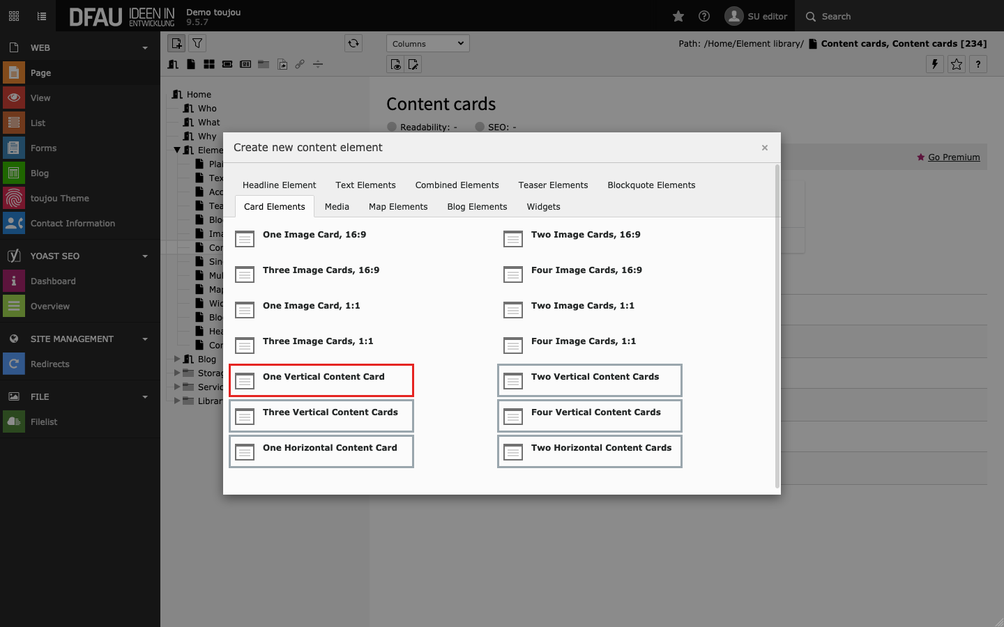
Create content card
- Click on the + Content button to create any card element.
- In the Card Elements tab, select the element of your choice.
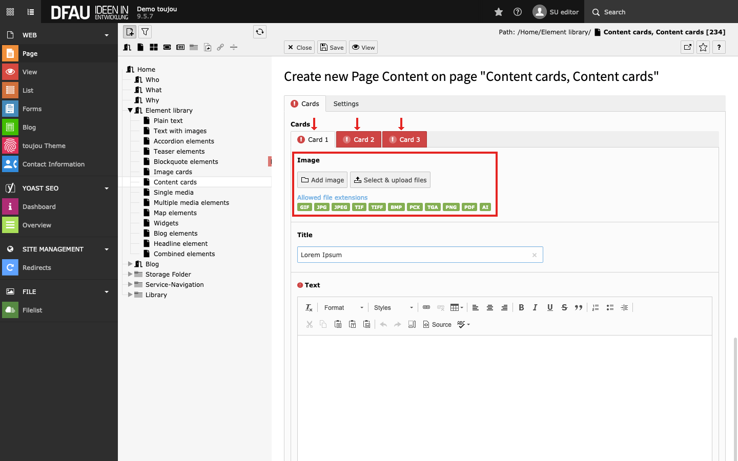
Insert images
- Click on the Add image button.
- Select an image file from your file list or upload a file to the appropriate folder.
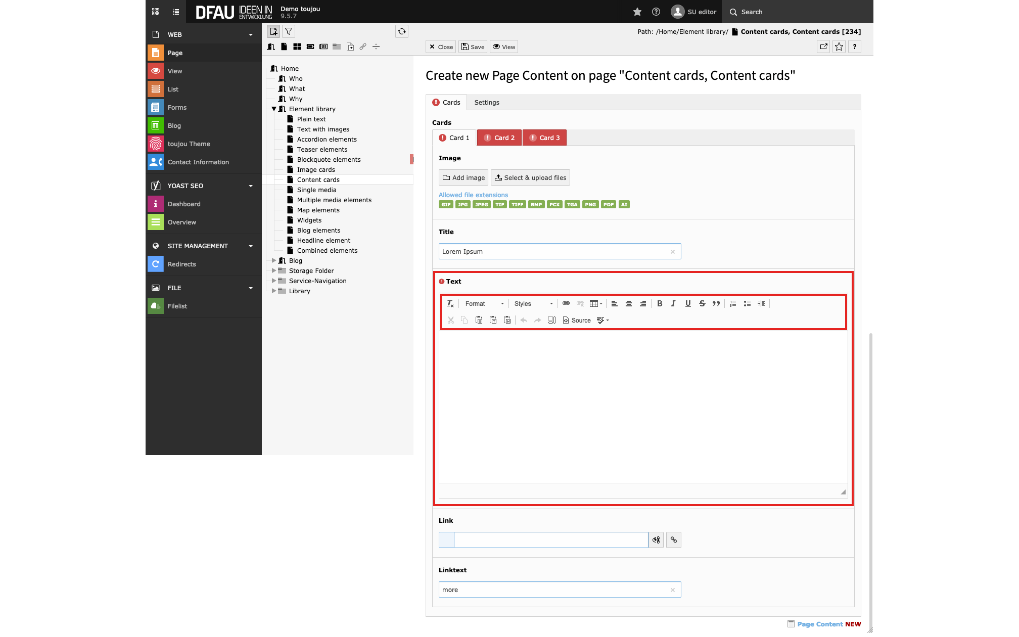
Insert and format text
- Paste your text into the editor or into each editor per tab from left to right for multiple card elements.
- If you copy the text from another file, pay attention to possibly copied formatting.
- The text can be formatted directly within the rich text editor, with the help of the menu above the editor.
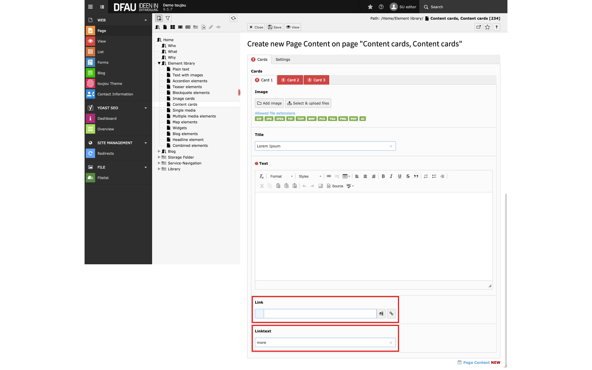
Insert link & button text
- Click on the Link button to insert a link.
- Enter a Linktext into mask to name the button.
- Select from any of the available tabs to link within subpages, elements or to an external URL.
Screen adaptation
Responsive behaviour: On small devices, all left-to-right cards are displayed above each other from top to bottom. Images of vertical content cards might be sorted left from the text field the smaller a display becomes.
Worth noting:
- If no image is uploaded, the cards can also be used as a text content button.
- If no link is stored, the cards can also be used as a styled content element. No button is displayed.
Linked topics
toujou set-ups & TYPO3 tutorials related to this element description.