Responsive design with toujou
Ready for smartphone, tablet, and computer
Since 2016, more people search the web on mobile devices than on PCs and laptops. The change in behavior brought about the need for Responsive Design to ensure your site works well on all devices. toujou has you covered, with mobile first and responsive design.
Look good without a drop of sweat: Your website must be perceived as professional — a reflection of you and your business. From the day you sign up, toujou ensures that every text and image is optimized for the device it is viewed on. That's technology for digital success.
Try before you buy — your exclusive website demo
Start your free 7-day trial with no obligations! Get to know toujou and keep all your changes when you buy.
The benefits of responsive design

Context is king
Responsive design is the logical and practical layout of your content on all devices. Just because your website looks good on your smartphone, doesn’t mean it will look good when it’s viewed on a tablet or computer.
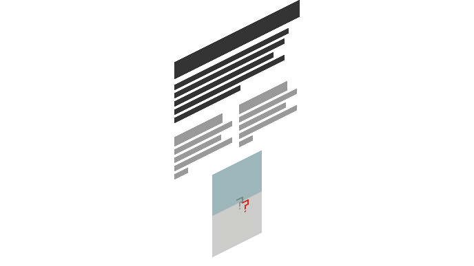
For example: Our goal on this page is for you to sign up for a free toujou demo. We created an info box “Try before you buy – your exclusive website demo” with a call-to-action. Let's use this info box to explain responsive design.

Location matters
Location is also important. On desktop computers, and most laptops, you will find our offer to test toujou right next to the introductory text. This is logical and effective. We want our demo to be clearly visible and right next to the introductory text. That's the best way to sell our services.
Constrained space
How do we deal with our offer of a free demo if there isn’t enough space next to the introductory text?
If there isn’t enough space and the responsive design is bad, content boxes like ours are either hidden or moved to the bottom of the page, far away from where they belong. That is not ideal.

Better together
toujou combines responsive design and logic to ensure that your website is displayed correctly on all devices. The info box is a logical partner to our introductory text and should be displayed below the text on small devices. Because we're using responsive design consciously, your content will always be displayed in the right context.
Responsive design best practice
Usability: Hamburger button, navigation, and text
Responsive design affects user experience. With toujou we use best-practice approaches and well-tested themes to make your website work well with the screen size of any device.
Depending on the device, your website will respond by changing text size and navigation layout to enhance the user experience. On smartphones, navigation is hidden behind a button with three horizontal lines (called a Hamburger button). When you click it, the menu will appear, filling all or most of the screen.
For larger screens, the first navigation level will always be visible at the top of the screen. Hovering over one of the items will show a drop-down menu with more levels.