Image-Teaser Slider, left
A selection of several teasers in a slider with one media source (original format) displayed on the left and the text displayed on the right.
Sample view Step by step guide Screen adaption
Sample view
Step by step guide

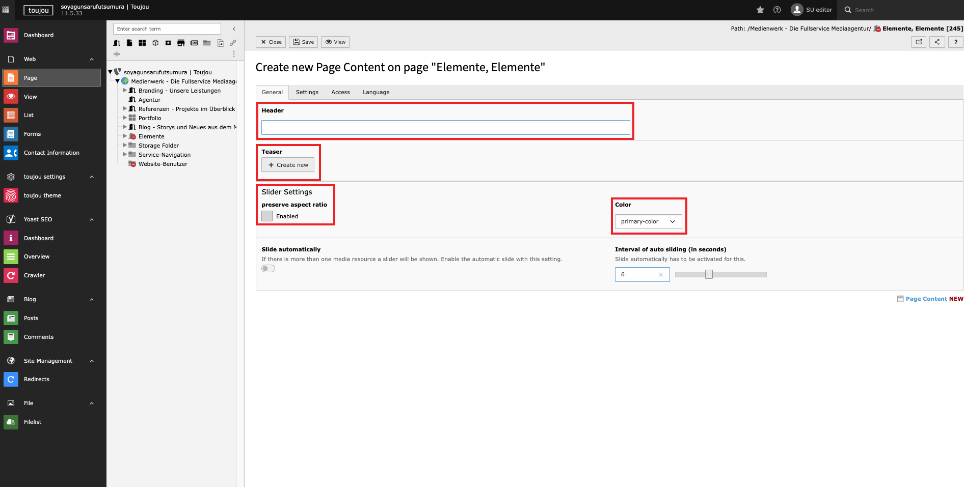
Create a teaser slider
- Click on the + Content button to create any teaser element.
- In the Teaser Elements tab, select the Image-Teaser Slider, left.
Creating slides
- In the Header field, enter a title, which will be displayed as an H3 heading.
- Click the Create New button in the teaser section to create multiple teasers.
- In the Slider Settings you can enable maintaining the aspect ratio of media elements by clicking the checkbox. Refer to the note below for more details.
- In the Color section you can define the display color of arrows and progress bar bullets. Element design colors are available for selection.
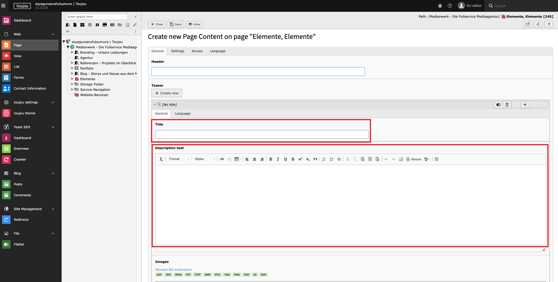
Insert slide title and text
- You can specifiy the title for each slide in the Title field.
- Enter your text in the description text field. If you're copying text from another file, be mindful of any formatting that may be carried over. You can format the text directly in the text field using the menu above it.
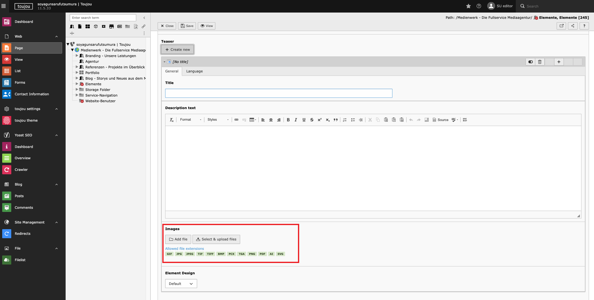
Insert media
- Click on the Add Image button.
- Select a file from your file list or upload a file to the corresponding folder.
Screen adaption
The Image Teaser Slider, left gives you the ability to showcase multiple teasers in a loop. Each teaser is individually created and can be displayed in various colors using the Element Design.
In den Slider-Einstellungen Farbe (unter dem Reiter Allgemein) können Sie auch die Slides-Pfeile und Progress Bar Bullets mit dem Element Design variieren. Die Bullets (Sliderbuttons) befinden sich am unteren Abschluss des Elements und zeigen zugleich die Anzahl der Slides an.
In the Slider settings for color (in the General tab), you can also customize the slide arrows and progress bar bullets using the Element Design options. The bullets (slider buttons) are located at the bottom of the element and also indicate the number of slides.
Responsive: If there is not enough space to display the text block and the media next to each other, any teaser media will be placed above the text block. Also, regardless of the original orientation, teasers will always be displayed correctly on small screen devices.
Linked topics
toujou set-ups & TYPO3 tutorials related to this element description.